Behind The Artwork: High Tides - I´m Not Giving Up, I´m Just Starting Over (2017)
Nottingham Quintet High Tides classify themselves as ‘putting emo into pop punk since 2015’. The members have for the most part, been in each other’s lives for many years, some even from school age: “We’ve all been in bands previously both together and separately, but this final line up just clicked instantly both musically and socially”. Within the busy sphere pop punk, they comment that what sets them apart from their contemporaries is both their music and their live show: “We feel our sound brings some fresh elements to the UK Pop punk sound, being a bit deeper and more mature than other bands on the scene, tending to stray from the typical ‘In sound’ currently being shared. Live it’s always crazy energetic and we put absolutely everything into it, we don’t feel we’ve done a good enough job unless we come off stage looking like we’ve had a bath in sweat.” With their forthcoming mini-album, ‘I’m Not Giving Up, I’m Just Starting Over’ set for release shortly, March 17th via Scylla Records to be exact, the band discuss the creation of it’s artwork….
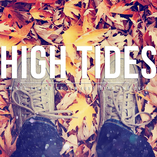
All of the artwork for ‘I’m Not Giving Up, I’m Just Starting Over’ was done by our bass player Tom, and as a collaboration with a couple members of the band. We always try and do artwork in house when we can as that makes the whole project that bit more personal for us as a whole.
The main thing we wanted to represent was the feeling of change, hence the reason for the autumn theme throughout the artwork as it really conveys this idea well. With the leaves changing and falling, it's like a fresh start, which is a idea that runs throughout the whole record. With the back cover artwork what we wanted to represent with the map was a feeling of being lost and trying to find yourself again, again tied in with the autumnal theme.
We expanded this imagery all through into the inlays by using the same photo that's on the back cover, but adjusting the colours and added key recording credits. For the CD we just wanted to keep it simple and plain, as there's so much going on in the actual cover, meaning we just used the same fonts and lettering and background colour. The overall package tie together well.
We slaved over this cover for a long, long time and it has taken many different forms and designs to get to the final one that we have today. Overall we are super happy with how it came out really proud of what we have made. We really hope everyone enjoys it and can see the effort we have put into making it the best that it can be.


No hay comentarios