Behind The Artworks: Monolith - The Lord Conspirator (2020)
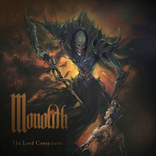
The “The Lord Conspirator” cover art constitutes the Monolith’s third collaboration with Port Elizabeth artist Sjoerd Leistra. The artwork was a result of multiple conversations and rough drafts that took place during the production stages of the album.
“The Lord Conspirator” is a concept album with intensely personal layers of meaning found throughout its lyrical content. We wanted an album cover that would accurately represent the lyrical themes and complete the overall sensual experience of the record by acting as its visual manifestation.
The artwork depicts the album’s two central characters during the final moments of the narrative. Set in a dreamlike void, the moment of confrontation and distress is emotionally depicted. The scene echoes the lyrics delivered during the album’s final song, ‘Saturn’, by depicting “the twisted blades poised to strike”. One of the main themes running throughout the album is the process of psychoanalysis of the self. It deals with the act of confronting oneself in the hope of improvement, despite the inner turmoil and chaos that will arise, inevitably spilling into your life.
We are thrilled by the accuracy with which Sjoerd was able to capture the album’s mood and vision, and asked him to provide his rational for the artwork:
“The brief for this artwork was great in that I was given a lot of freedom with the medium and design. Chatting to the band beforehand, they wanted a lot of symbolic imagery, which I noted down and later incorporated.
“The biggest challenge was in the design of the Lord Conspirator. He was intended to be an ambiguous figure, not linked to good or evil but rather a manifestation of this man's struggle. Whether he is part of the man or a separate entity, is up to the viewer.
“I wanted the design of the being to be unique and not comparable to other designs. It has a humanistic form but with unusual proportions. His features are also distorted, except for its mouth which was intentionally left detailed as its use of dialogue was a point of focus in the narrative.
“The artwork was done on a sheet of smooth plastic, using acrylic paint and inks. The colours were used to give a sense of impending aggression and the brush style in the background is intended to create movement within the main characters.
“Overall, this artwork was another great collaboration between the band and I. The hope is that it cements the imagery in the viewer's mind when listening to the album.”-Sjoerd Leistra.


No hay comentarios